Successful Rebrands Focus on Stories and Experiences, not Logos and Colors

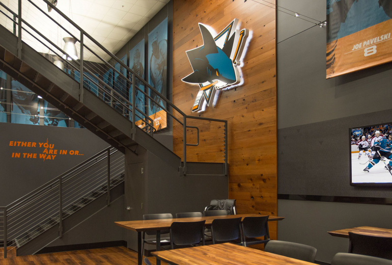
For sports teams, weathering wins and losses comes with the territory. Weathering a rebrand is a different beast. After months or years of focus groups, interviews, concepts and revisions, an organization unveils new colors, logos and slogans to the world. It seems no matter the actual contents of the re-design, these organizations come to this realization: Fans, especially on social media, are harsh judges and critics. “There are few things more fickle than rebranding a sports team,” Adrian Covert writes in this piece for Fast Company. In studying rebrands — successful and unsuccessful — of sports teams all over the world, Covert arrives at a conclusion that mirrors how we approach our work. In interviewing sports organization personnel in graphic design and executives from creative agencies, Covert notes a key to success in rebranding is to “focus less on logos and colors, and more on creating an emotional connection through experience.” This is true in the professional or college sports arena, in an academic facility or in the corporate world. Earlier this year, Sports Business Journal noted how venues are dealing with the changing attitudes and preferences of a new generation of ticket holders. This generation deals in a currency of “likes” and social cachet that puts as much or more value on the shared experience of the moment than the actual event. We believe this concept pertains not just to a space but to the brand itself. The Toronto Raptors, for example, recently rebranded not to excise all of its ‘90s-era touchstones, such as the garish color scheme or Jurassic Park-influenced namesake. Instead, they rebranded around their outsider status as the only Canadian team in the NBA. Advent noticed something similar in our ongoing work with another ‘90s-expansion franchise, the San Jose Sharks. The Sharks listened to their fans when they told them not to touch that teal. Similar to the Raptors’ pop culture branding, the San Jose Sharks’ teal was a popular trend among new teams in the ‘90s. The Sharks were proud of starting such a trend and left the color untouched. In fact, new logos in the last decade added teal. When Advent began work with the Sharks on the SAP Center and Sharks Ice, the franchise didn’t want to rebrand as much as it wanted to re-position. This is no longer the 1992 expansion team; it is a Stanley Cup-contending franchise with a 25-year tradition. “We’ve had some significant accomplishments, and it was time to really map out our history,” Jon Gustafsson told us. “This is a testament to that.” The ‘90s teal remained, but the experience of being inside the Sharks’ training facility conveyed a feeling not of being part of an expansion franchise, but instead the feeling of being the class of the NHL. Because the Sharks listened to their fans, they adapted their brand to include new stories without sacrificing the experiences and stories their fans hold dear.